



Graphic identity
The Manual of Identity and Standards Graphics regulates the use of the logo of the Institute for the Rights of Persons with Disabilities, I.P. (IDiPD), as well as its applications to the entire Institute and external bodies.
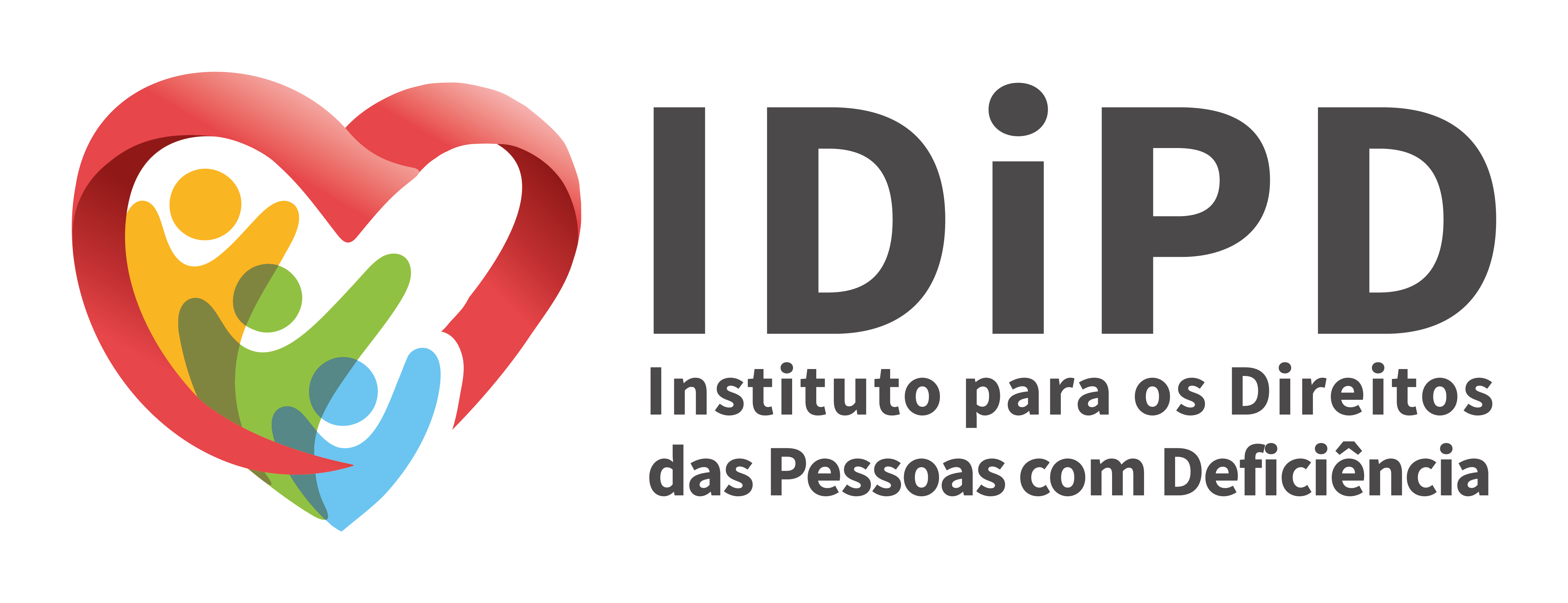
The image shows, on the left side, three figures, arranged backwards, represented by three colors, which symbolize joy (yellow), the highest, renewal (green), in the middle, and confidence (blue), the lowest. They are embraced by a heart. These three figures also represent the commitment, collaboration and rights of persons with disabilities. The heart, in pink/red, represents love and embraces the mission of promoting the rights of persons with disabilities and the exercise of full citizenship. On the right side is 'IDiPD' and underneath, in two lines, the word 'Institute for the Rights of Persons with Disabilities' in dark grey.
The visual identity that defines the IDiPD image is a composition of two basic elements that cannot be dissociated: the symbol and logo.
The Symbol congregates simultaneously 4 elements, 4 colors and 4 concepts for the identity of the lDiPD and concentrates in its composition the strength of multiple meanings.
The logo is represented graphically by the acronym "lDiPD" and the designation "Institute for the Rights of Persons with Disabilities", in two lines.
Humanity The red-coral heart, which embraces the three figures, represents care, closeness and appreciation of human dignity. It expresses the commitment to recognize each person in his or her uniqueness, promoting a culture of respect, empathy and solidarity.
Rights The golden yellow figure represents the realisation of human rights and full citizenship of persons with disabilities. It symbolizes hope, the valorization of the person and the construction of opportunities that allow active participation in society, on equal opportunities.
Cooperation The olive-green figure symbolizes the strength of partnerships and collaborative work. It is inspired by the symbology of the olive tree, associated with longevity, trust, unity, peace and harmony. It represents collective resilience and the ability to achieve more sustainable results through cooperation between people, organisations and communities.
Commitment The sky-blue figure reflects a close, oriented and up-to-date performance. It represents the determination to make it happen, assuming the mission of the institute with responsibility, a sense of priority and a focus on social transformation.
As a whole, the brand represents a bond of union, empathy and belonging. It symbolises the ability to move forward together, overcome challenges and build an accessible and equitable future for all people.
Its visual elements evoke values such as: ◦Humanity; ◦Empathy; ◦Rights; ◦Cooperation; Autonomy; ◦Commitment; ◦Participation; ◦Confidence; ◦Resilience; ◦Sustainability; ◦Union; ◦Development; ◦Peace; Harmony.
The lDiPD brand, more than a graphic symbol, affirms the commitment to leave no one behind, promoting a full, active and participatory citizenship by and for all people.
Consult o Manual of Identity and Graphic Standards IDiPD [in PDF].
Download the different versions of the logo.